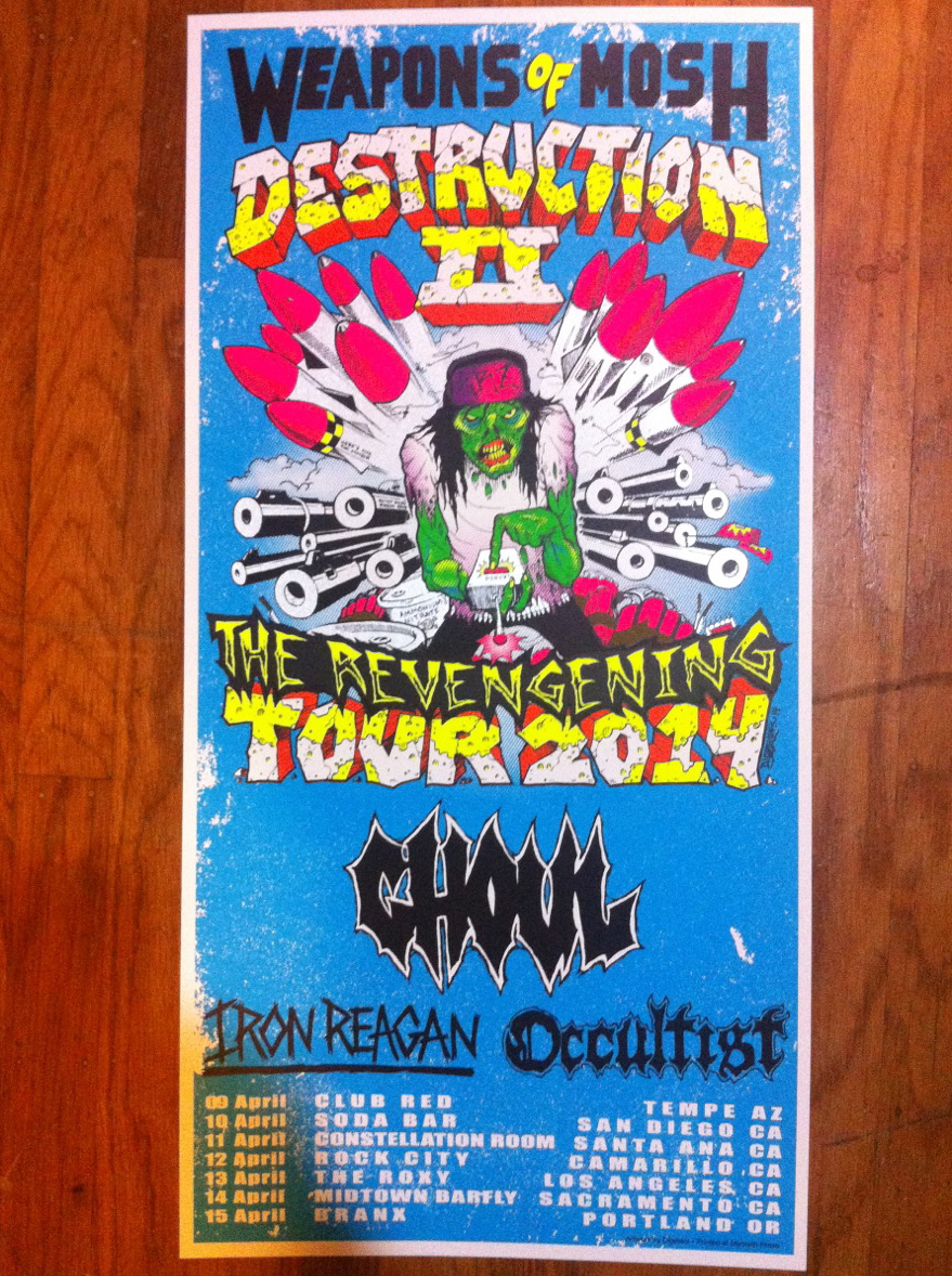
I think Digestor from the band Ghoul is a fabulous artist. That’s why I decided to print, outside of my time working for Monolith Press, their upcoming tour poster. In no way did Digestor and the crew from Ghoul hold an axe to my throat and threaten to eat my family if I didn’t agree to do it. Nope, it was all because I believe in Digestor’s art. And that’s how they got this:
Digestor supplied me with the drawing and I was violently forced to happily did all the coloring and separations. Now, just because this was a poster for a maniacal lunatic guy whose art I really like didn’t mean I couldn’t make things a little easier on myself for the actual printing. Being a printer by day meant I had a few tricks up my sleeve to ease this poster along with minimal headache.
The first thing to wrap your head around with screen printing anything, be it shirts or posters, is the subtractive nature of the color. Unlike an image on a computer, which adds light pixels to go from black to white, ink and any other physical medium does the opposite, with colors covering each other to go from white to black. Generally. That’s a very simplified view of it. Here’s something a bit more complicated.
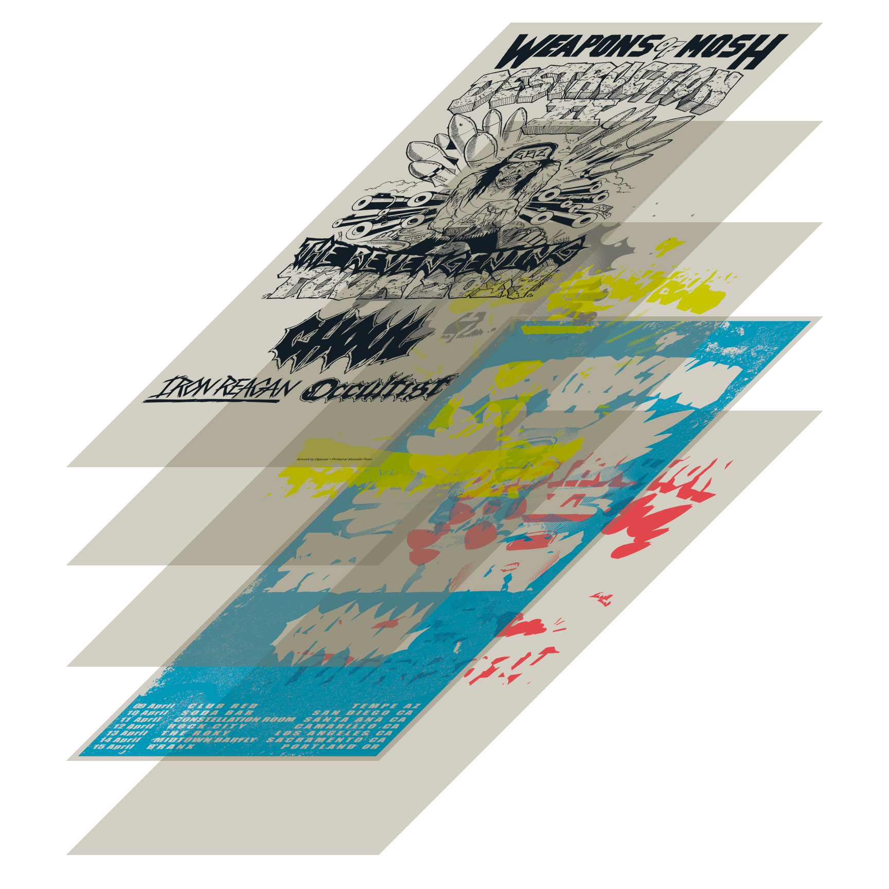
That’s how to think of a screen print… layers of color going over each other. I don’t always start with the lightest color. It all depends on the final product. In this case, I started with red because we use water based ink which has a tendency to stretch the paper out a little. Starting with a color that has little coverage helps that out and keeps tighter registration on the print. That’s why it’s important to think in three dimensions when putting together a two-dimensional print.
The subtractive nature of the colors in screen printing can be very helpful when it comes to trapping. That’s when a later color covers up the seams between earlier colors and makes an image look perfect. It’s never actually perfect because screen printing is totally an antiquated craft practiced by idiots like me who don’t know how to invent a million dollar app. A lot of times, the final color is a black line image and it does a lot to cover imperfections.
In this case, I’ve made the black line a light, transparent magenta to illustrate what it’s doing. Underneath the words “weapon” and “mosh” I’ve let the background bleed entirely through the words, because the blackline will be opaque over the blue. If it’s a little off, no one will notice, and I don’t have to worry so much about registration. Around the image, it gets a bit trickier, but you can see the blue and the white bleed underneath the black line. That trapping gives the image room to move as each piece of paper might have stretched a little differently.
Also in the above image, you may have noticed the blue looks a bit weathered. While this is an aesthetic choice, it also serves the purpose of making a big field of color easier to print. At our shop, we call that distressing. I love it when designers use this look, because if any bugs or dust get in the screen while I’m printing, they’re not noticeable amongst the detritus and I can continue not giving a shit.
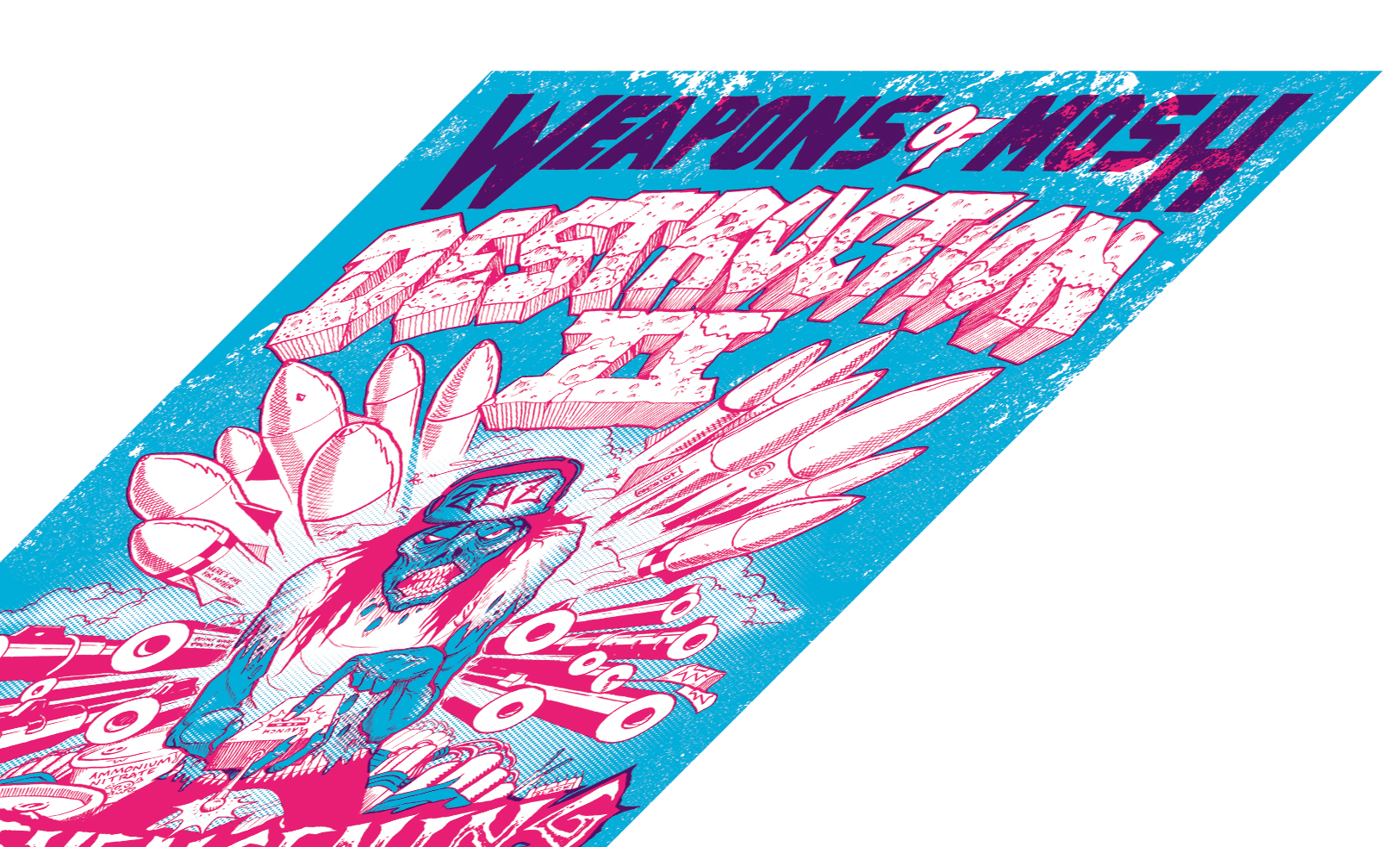
I had decided to do some shading on this print. Screen printing only makes giant block of color, so to print the shading I had to halftone my image. This is the little dots you see in a newspaper photo. It’s a snap to do in Photoshop, but not EVER with the filters. That looks terrible. I work with spot channels instead of layers, so the first thing to do is split out the channels.
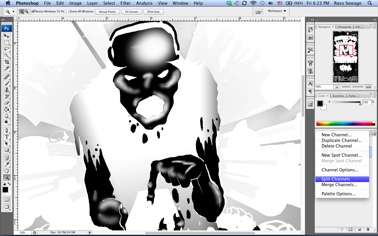
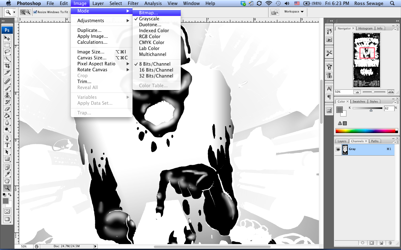
Now with the channels separated into individual files, those files are converted from a grayscale to a bitmap image.
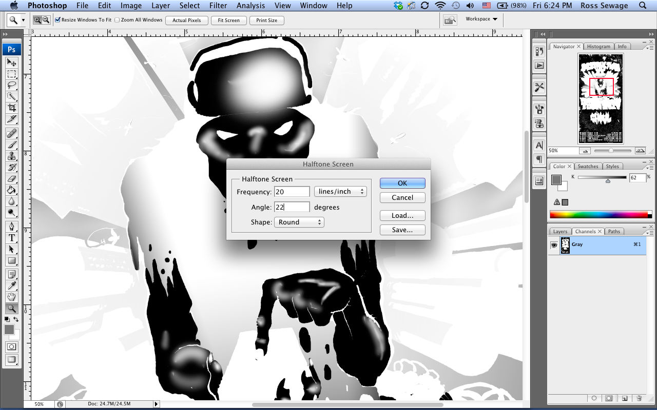
The pop-up windows will take you through and ask you for the resolution (300 pixels/inch) and a method (halftone screen). On the halftone screen pop-up, you have some choices to make depending on the actual screen mesh a color will be printed with. Our shop can take a frequency of lines/inch of 45-50… meaning smaller dots. In this case, I went with larger dots at 20 lines/inch for an old-school comic book look and because they’re way easier to print. The angle you choose is really important, because you can end up with weird patterns as dots lay over screen mesh. Our rule of thumb is start at 15 and add seven. Each color should be a different angle or you can end up with a moire pattern that doesn’t look good.
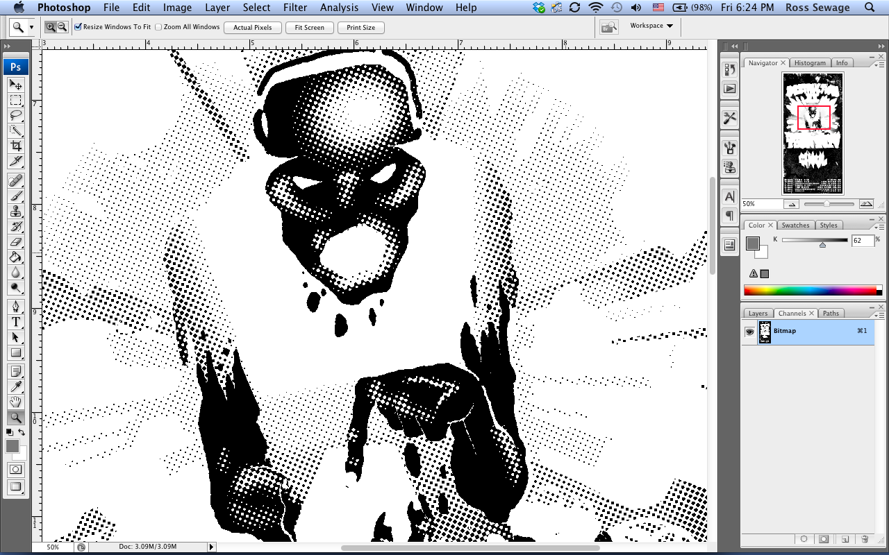
And then you get a nice chunky halftone with round dots. Select and copy all of this and put it back into a channel on a new file with the correct color.
With good preparation prior to printing, a print can go really smooth. This is important not only for the printer, but the designer to consider so a printer isn’t cursing their fucking name when they have to spend all night at the god damned shop. Not that I would ever do that. In this case, I peed myself with four cannibals breathing down my neck merrily sailed through the print and watched it all come together beautifully.
Be sure to check out Ghoul on tour in April:
4/9- Tempe, AZ – Club Red
4/10- San Diego, CA- Soda Bar
4/11- Santa Ana, CA- Constellation Room
4/12- Camarillo CA- Rock City
4/13- Los Angeles, CA- The Roxy
4/14- Sacramento, CA- Midtown Barfly
4/15- Portland, OR- Branx