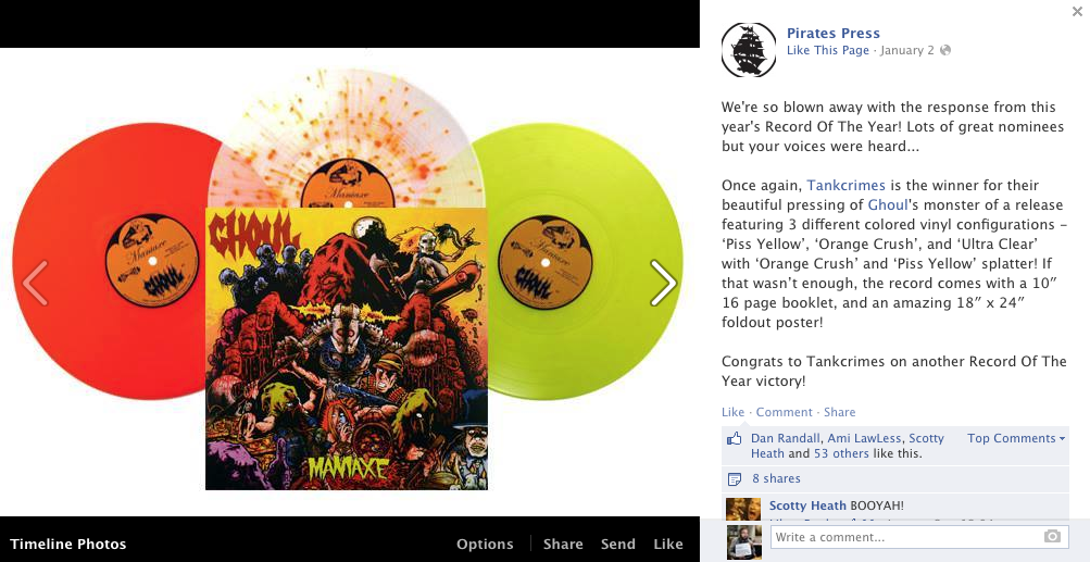
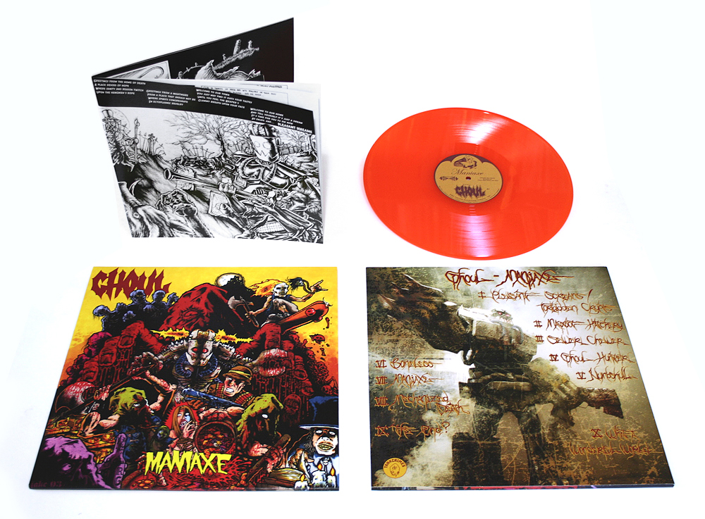
While I’m sure some of it had to do with the fervent fan base and maybe even partially the music, it’s nice a record I did the design and layout for was voted Pirate’s Press “Record of the Year” by Facebook voters. Ghoul’s Maniaxe LP won the prize, but let’s be honest…. it was mostly ’cause of the layout, right?
Doing the layouts on a 10 year old record is no joke. A lot of people were waiting for Ghoul’s second full-length to be on vinyl for a long time and expectations were high. I didn’t want the packaging to disappoint. It wasn’t easy because 10 years ago no one bothered to make sure everything was prepped for this big-assed release.
I’d already gotten the original layouts from Sly the Gore Gnome for the 2008 CD repressing of We Came for the Dead / Maniaxe. These files needed some minor cleaning up, but they were still sized for CD. Putting this onto LP was going to be a bitch because I didn’t have the original art. We’d lost touch with the cover artist and searching for him was proving fruitless. It turned out for years the lad had been going by a slightly different name. Jake Karns was now Jason Karns and I found him online in 2012 at http://fukitor.blogspot.com. He graciously supplied us with his beautiful cover in high-resolution and the project could continue. Seriously, nobody needs to see the many iterations of the cover I tried to blow-up and sharpen with horrid results.
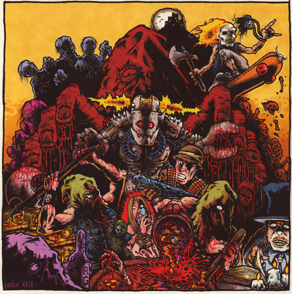
One thing eagle-eyed designers might note is that Jason’s original image provided no god-damned bleed on the art. That’s why on the original release, things like his name and the chap-on-the-lower-right’s eye were cut off. I wanted to avoid this because I adore this cover and wanted it to be seen in all it’s glory. I had to draw in some details and extend the art so that it would carry over onto the LP jacket’s fold lines while preserving the main image for the front.
It’s not the most gloriously done addition, but that’s why artists always need to remember to put some bleed edges around their artwork.
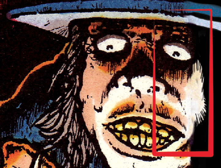
The original CD release of Maniaxe used a piece of the cover blown up for the back. I understand why Sly did this, what with a lack of art at the time, but I hate this design choice. Having full access to all of Ghoul’s material over the past 10 years, I was able to choose something a bit more distinctive. Ghoul had some photos taken by the über-talented Taylor Keahey. I mined the shoot for an incredible shot of Killbot, one of Ghoul’s main antagonists that was introduced on Maniaxe. The only problem was he didn’t quite match Jason Karn’s vision of the murderous automaton. I fixed that in Photoshop.
This was Ghoul’s most skate-thrash friendly record. I felt the back cover text could reflect that. I opted for tagging-style text, but I’m not a tagger. I hate tagging. Fortunately, one Dino Sommese stepped up and brought his tagging talents to the table. For once, I encouraged it and we got some killer looking text.
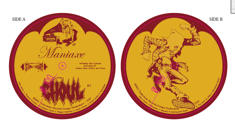
On all the Ghoul releases I’ve laid out, I’ve maintained a trope Ghoul started in 2006. For CD faces and LP labels, we’ve used a parody of the old RCA Victrola label. It’s been modified a bit from time to time, but I like having some consistency to a band’s releases. In this case, I also added a piece of artwork from Digestor to the side B label that was included in the original Maniaxe CD, because I wanted to include as much from the original release as possible.
The insert for the record is probably the coolest I’ve ever had the pleasure of working on because of one Lucas Ruggieri. Years ago, this young kid showed Ghoul some cute comic book pages he’d been working telling the story of the song Forbidden Crypts from Maniaxe. We thought it would be cool to include that as a comic book insert. Well, in the interim, he ended up drawing the song Maniaxe… and holy shit… Lucas’ artwork grew by leaps and bounds. He’s a world class illustrator, now. We threw it all in their because damn… that shit is rad. He sized it as a comic. I had to resize the artwork because Tankcrimes wanted to include it as a 10″ square booklet, on account of having all the packaging done in one place. With the comic book, this puppy was dunzo and a fitting release for one of Ghoul’s seminal recordings.
A quick word about black… so this isn’t just some self-congratulatory blog post. What is black? In CMYK printing, black is many things. The K in CMYK stands for “Key Color” and it is, indeed, black. But it’s not the blackest black. For a richer black, a combo of cyan, magenta, and yellow needs to be added into the K black. One might think to add 100% of each of these for the richest black, but that’s 400% color and your printer will hate you for that because you will explode his machines.
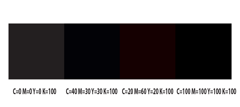
Printers refer to the total ink coverage, or TIC. Some printers allow as high as 320% ink coverage, others as low as 240%. Exceed their maximum, you get smudges, smears, and ink that cannot dry as it goes through the print drums. I usually run a 200% black combo with C=40%, M=30%, Y=30%, K=100%, ’cause it’s fucking dark enough. I corrected all of Lucas’ comic pages to be this level of black for a consistent print through the whole booklet.
While one should be checking gamut levels and using an eyedropper tool to check the TIC and the CMYK levels, nothing is a better reminder of different blacks on a page than visually seeing it. If yer an amateur desktop publisher, make sure you have your preferences in whatever program you use to display “rich” black. Otherwise you make dumb mistakes like I did on a Skarp LP I laid out 10 years ago and end up with two different blacks. It still bothers me.
For black text on a light background, it’s a good idea to run it at just K=100%. Just think about how four plates have to line up and how it could be off register for those teeny tiny lines.

If none of that black talk makes any sense to you, then just fucking pay me already to do your layout.
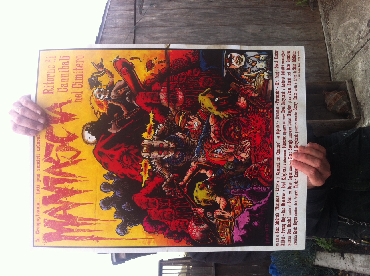
For this amazing Tankcrimes release of Ghoul’s Maniaxe, we needed to have something special for the limited “die-hard edition.” The cover looked so much like an old movie poster, I thought, hey… what if it had been. I envisioned it as an Italian giallo flick. I had to come up with a title in Italian that reflected the original’s pun and find definitions for all the credits in Italian. Only 200 people were able to get these; I thought it was a fun edition for the true fan-addicts.
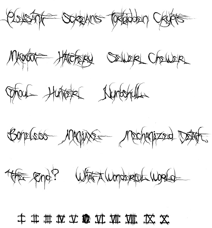
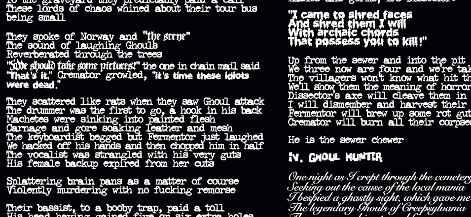
Finally, it’s time for some audience participation. On the insert to Maniaxe, I retroactively added a stylistic trope I tried to start on 2006’s Splatterthrash. The lyrics are in different fonts to indicate different people (or monsters) speaking. Each “thing” gets their own font. This was in addition to the comic-book style captions I’d come up with for Splatterthrash. As I was not involved in laying out 2011’s Transmission Zero, the font idea was forgotten for that release. Is it cool? Annoying? Helpful? Hard-to-read? You be the judge and comment! I’m all ears… or eyes, I guess, since I’ll be reading. Seriously, I have no idea if this sucks. Help.
Did you really use CMYK process to print what looks like a b&w booklet? Seems extreme…
Who needs to go buy their copy of the first press? Neil does. The booklet includes colors in the comic portion. The repress will only have a slip insert and will be printed 100K with no other colors.