The grind band C.U.N.T., ever-so pleasantly named, contacted me a couple months ago about doing a shirt design for them. I finally got around to doing it, just in time so they could print it up for their trip to Mexico. Herein lies the process and the results.
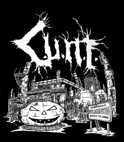
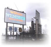
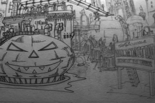
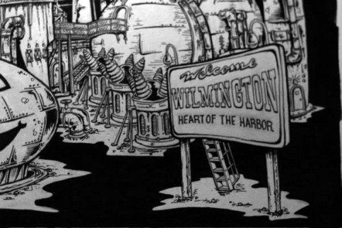
The band hails from Wilmington, a town heavily beset by oil refineries. Their concept was to have two landmarks of their home town, the ConocoPhillips “jack-o-lantern” storage tank and the town’s “welcome” sign, prominently featured with an oil refinery. Their logo was to be coming out of the smokestacks. A cheery picture of life at home, indeed.
The pictures they supplied me for reference included the following:

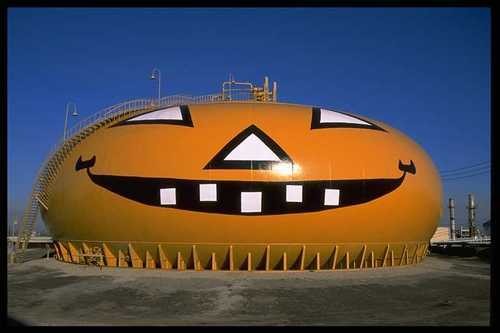

That jack-o-lantern is freaking retarded looking. Apparently, they actually pass out candy at the oil refinery. The candy is probably more nutritious for the kids than the local water supply.
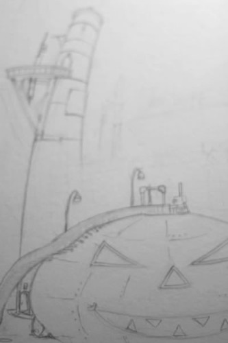
I definitely didn’t want to depict a scene of blissful Halloween happiness, nor did I want to make a technical drawing for a band called C.U.N.T. I opted instead to work on something a bit more sinister looking, with forced perspectives distorting reality and dirty looking buildings to contrast the idea of being welcomed into this desolate burg.
Yep. Fucking deep.
I loosely sketched the overall design on a piece of 14″x17″ bristol board. Why this size? Because it generally fits on a copier at Kinko’s for reduction. More on my ghetto – budget method of scanning in drawings later…let’s draw some happy little pumpkins!
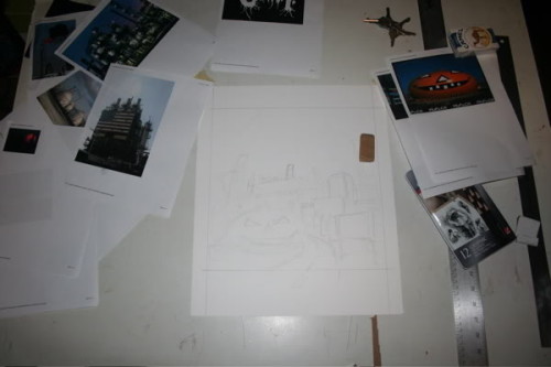
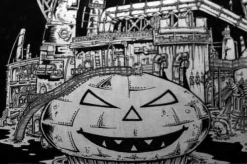
My rotted drawing desk, scattered with reference material instead of the usual bills. The drawing had to be designed very horizontally, as C.U.N.T.’s logo is BIG and I wanted to actually re-draw it as part of the original piece. I next went to work filling in detail.
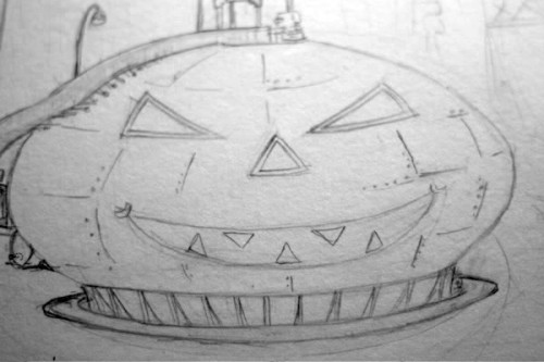
I started with the pumpkin, because really that piece of corporate bullshit was the centerpiece of this drawing. I took a few liberties with it, making it a bit angrier and more evil. I tried a few sketches where I’d really gone buck wild with a horrific version of the orange oil-storing gourd, but I felt it didn’t resemble the actual landmark enough. I had to restrain it a touch.
More detailing…
I tend to actually draw the shading as if it’s ink from a paintbrush. I think it helps me later on when I actually pull out the india ink to already have an idea of where I’m going to slather on the darkness. Or maybe I’m incompetent with a brush.
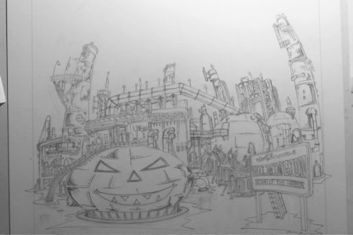
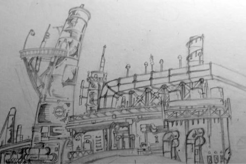
The pencils on the oil refinery are done. Basically, I just kept adding crap and dials and pipes and holes. I was channeling Geoff Darrow, or trying to… as he’s infinitely more talented and skilled. The challenge was to put dingy details in a design that could be printed nicely on a tee shirt.
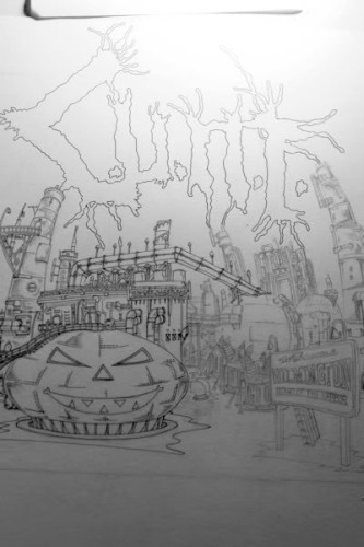
Because there were a lot of mechanical items in the drawing, and not just crazy zombies or guts, I started the inks with a pen. That’s something I usually avoid in lieu of attacking it directly with a brush.
I went at it with a .3 pen, but I still tried to avoid using a ruler. The lines needed to curve with the forced perspective and keep a bit of organic, dirty quality. The last thing I wanted to do (or really, could do) was make this a clean, architectural blueprint.
See those transformers? I did a google image search looking for power transformers, and I ended up browsing through blogs about how rad the Takara Masterpiece Megatron toy was. I am easily distracted, it seems.
Eventually I came in with the brush and started laying down swaths of black, thickening lines, hatching, and giving varying weight to the lines to make ’em really pop. I also added some stippling here and there, as it tends to make things look even dirtier.
I really should’ve double checked the focus on my camera… c’est la vie.
I could have skimped on the ink, especially around the edges of solid objects. Theoretically, that can be done in Photoshop. Instead, I prefer to know exactly what the completed piece is going to look like printed on black. Well, that’s assuming a metal band is going to be printing on a black shirt. I feel that’s a pretty fucking safe assumption to make.
The piece is done. At this point, I headed over to Kinko’s. I reduce the drawing down there on the black and white copiers. This avoids Kinko’s charging me a god damned arm and a leg to use their oversize scanners. There is nothing printed and the employees do none of the work save for ringing me up. Even the ringing up can take ages at a Kinko’s, and it ends up being more than 20 clams. Rip off. Instead, I take home the perfectly printed and reduced drawing to my normal size scanner at home.
And then a family friendly band like C.U.N.T. can gladly peddle their wares at the local elementary school for the kiddies. Better them than ConocoPhillips.