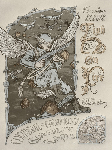
Back in August / September, Yob was coming through town. I love Yob. They were playing on my birthday and I wanted to do a poster for them. I talked with the band and they were down. A week before the event, after just starting the inks, it was pointed out to me the promoter already had a poster. Shit. I didn’t talk to the promoter. I cancelled my job and enjoyed the show anyway. A month later, my friends at Secret Serpents offered me a spot in their High on Fire tour series. Well, why fucking let that art go to waste? I requested the date for the end of the world, December 21, 2012. This is what came of it.
Like all posters I’ve worked on, I don’t make a cent… unless I sell my own copies. This is the topsy turvy economy of the gig poster world. 35 of these bad boys went down to Santa Ana, gratis, for the band to sell. My copies are on sale on my website now. The process to get from there to here took longer than expected, but I was pleased with the results.
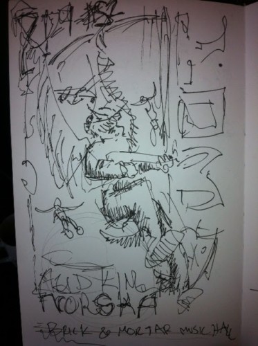
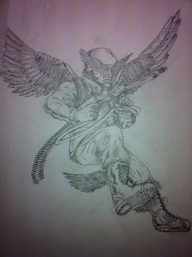
It started with a sketch, as drawings are apt to do. My sketches are like a doctor’s prescription, though; practically illegible except to me.
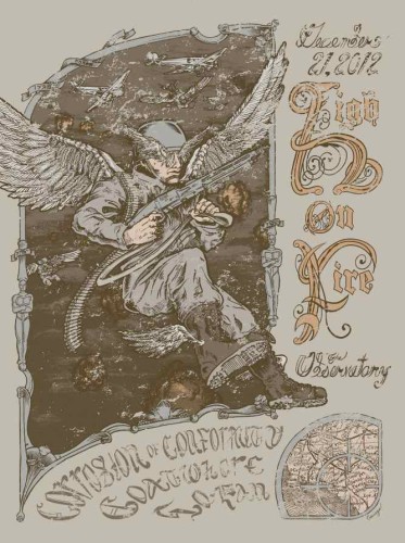
[contextly_sidebar id=”mUeSH2Ffh5IWjGOS4nBYRAD6m1GcRJQQ”]Seriously, what the fuck is that? Well, in my convoluted head, it’s a World War II Fallschirmjäger, also known as a German paratrooper. With wings. Specifically seraphim wings, the class of angels in Christian mythos that have six wings. Because, hey, a Nazi angel raining down doom and destruction during the battle of Megiddo; that’s wicked sick. It’s in keeping with the martial nouveau aesthetic that apparently only I do and, unfortunately, only I like.
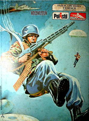
I like referencing from propaganda posters, but there wasn’t any good images of the Fallshchirmjäger that I liked. Instead, I found this great image of an 1960-70s action figure. Nazi toys… fun for kids from eight to 88!
The pencils started with the Fallschirmjägerangel as the centerpiece with everything else built around that. It probably shows in the final poster, as well, as the Fallschirmjägerangel has the most attention paid to it vis a vis line quality.
Next I moved onto the lettering. Being that this had a biblical quality to it, I wanted bible style type set. I modified some Fabrik style lettering to appear as the monks copying bibles and books by hand might have. It’s got of flourish and extra adornments.
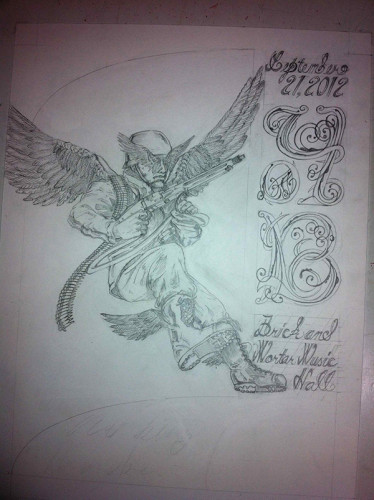
Hmm, does that say Yob, or oYB? Could be either. I was willing to bet that the eye would be drawn downwards and put together the name of the band correctly in the brain. Of course, this didn’t end up as a Yob poster, so the point is moot. I went on to finish the pencils and started up on the inks… and then halted them when I found out this wasn’t going to be a Yob poster.
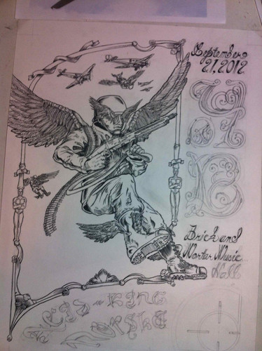
Fast forward a couple months, and the poster gets started up again, this time for High on Fire. Really, it’s ended up more appropriate. High on Fire has a lot more songs about battle and mythical monsters. Not usually Christian monsters, but hey, a myth is a myth to my atheist eyes.
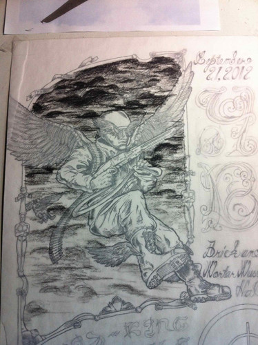
This poster was going to be boring without a background. The sky is pretty boring without some dark clouds. I didn’t want to put them on the original drawing, however, because I knew they’d need to be separated in the color process. I also wanted to add anti-aircraft flak explosions. I used some tracing paper and drew clouds with charcoal pencil.
I scanned these in on the computer separately. I also redid the lettering on the computer, as there was no way I would successfully erase all the pencil I’d already laid down for new lettering. When it came to the main band logo, I was looking at the “Y” in Yob and realized upside down it would make a perfect “h.” Well, that was my job a little easier. Plus, I still got to keep the same basic idea. Holy shit, even the date text could be salvaged from “September 21, 2012” to “December 21, 2012.” Not bad.
I busted out the Wacom tablet and drew it all up in Adobe Illustrator over the scan of the art. I put the cloud and explosion layers through some filters, added some olde time distress, and voila, I got my computer color composite.
Doing the color separations on the computer can be daunting, as I went through no less than three completely different color schemes before I got what I wanted. For the printing process, I overlaid a transparent white layer to make a five color process create at least eight separate hues. I chose some kinda difficult Pantone colors to match, exactly like I hate to mix for clients at Monolith Press. Apparently, I hate myself and want to make things difficult on me.
I did end up darkening the final color because the Photoshop color composites can be a little deceptive. In the end, though, I was happy with the final poster and the colors.
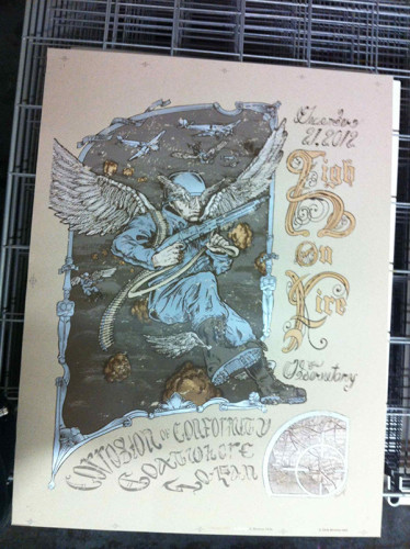
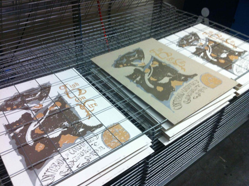
The above photo is a little off, having been taken with a phone before the final layer of ink was even dry. The poster at the beginning of this post is a much more accurate photograph.
I shipped the posters to the show in Santa Ana via FedEx. They went on sale December 21, 2012. I don’t know how sales for the band went, maybe bad. People thought there might be no tomorrow, especially after being pummeled all night with such an incredibly heavy line-up of bands. Today, however, we’re still here and walls need amazing art. In lieu of amazing art, how about my crappy art? These posters are now on sale through my website, so pick one the fuck up already! I’m fucking broke!
Doktor Sewage shop: https://www.doktorsewage.com/product/high-on-fire-dec-12-2012-18×24-5-color-print/