When asked about being part of a tour poster series, I have to think with my (empty) wallet. Almost all of these tour poster series are pay-to-play. After I get assigned whatever city, I have to come up with a poster I think I can sell on my own after the show. It would probably be easier if I had a bunch of pictures of mystical goats and sacred geometry lying about to slap a band logo on, but I don’t. This is what Atlanta gets from me for a Melvins poster.
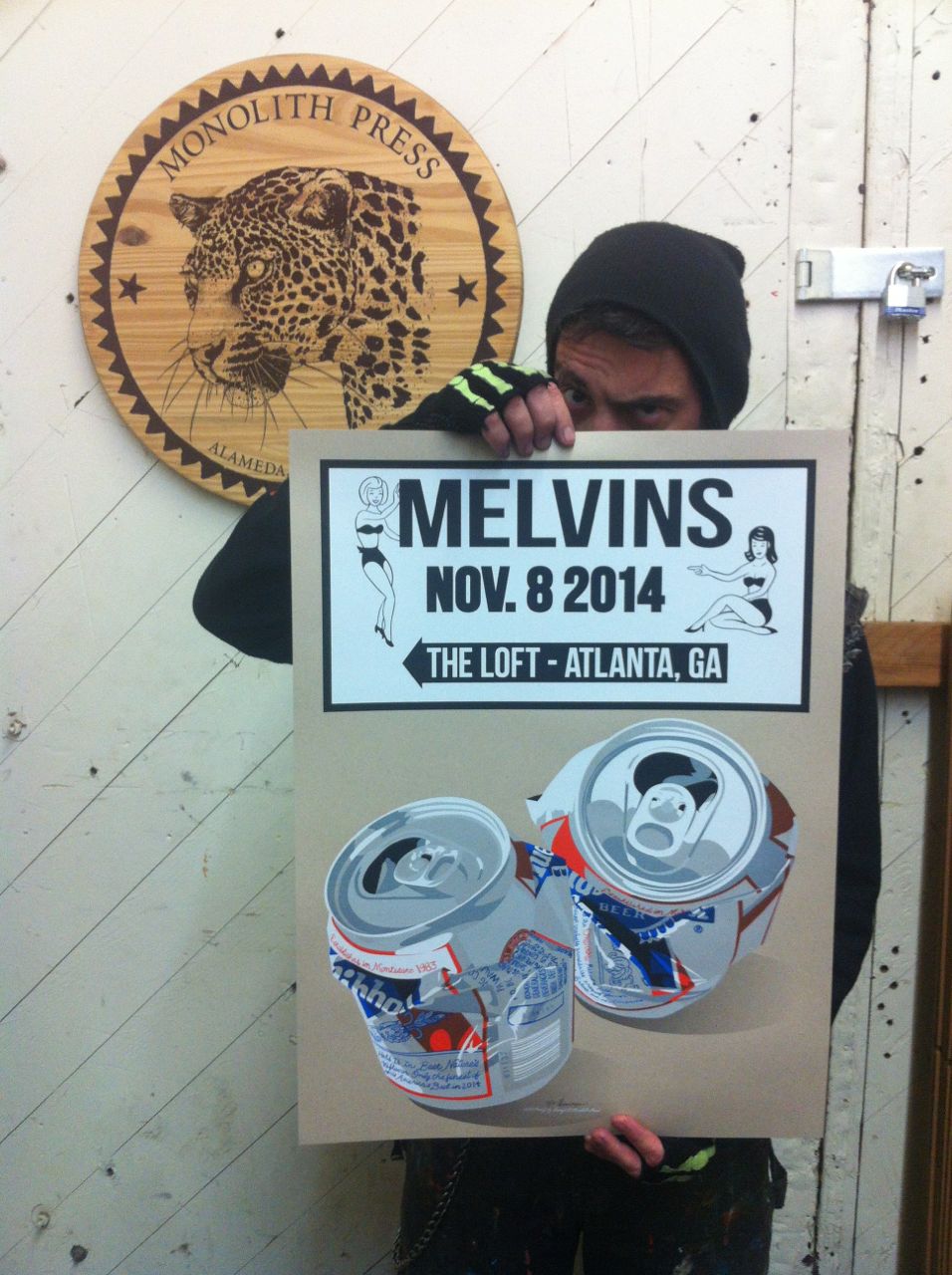
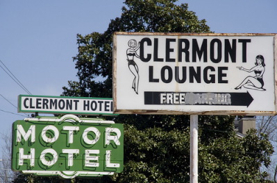
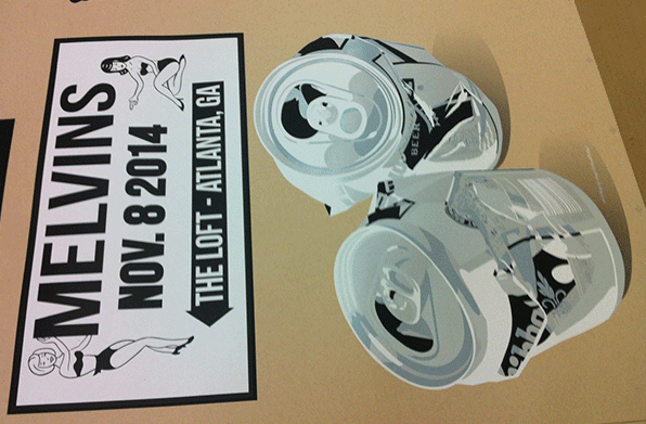
Yes… some kind of sign and two crushed beer cans. Inexplicable, right? Well, after a show I played last fall in Atlanta, we went to this place called the Clermont Lounge. It’s a world famous dive and strip-club known for its older, wider strippers. One of its most notorious acts is Blondie, a mature BBBW who crushes cans with her boobies. The next day I asked Amos of Atlanta’s Death of Kings what was notable for a gig poster in Atlanta. “Well, you just went to the Clermont Lounge.” Duh.
Now you get it. The poster is an homage to the famous sign that lights up the parking lot of the Clermont. The cans are Blondie’s. It seemed like the kind of perfect anti-establishment sleaze to compliment the Melvins irreverent take on hard rock.
Since I blew up a guitar effects pedal on my King Buzzo poster, I’ve enjoyed giving some rather plain objects grandiose treatment (like myself, on this here blog). Now I’m drawing a couple of crushed beer cans as magnificently as my little amount of talent can. After failing to scour the Interwebs for good photo reference, I opted to go out and buy a case of Pabst in the can. You know, for research.
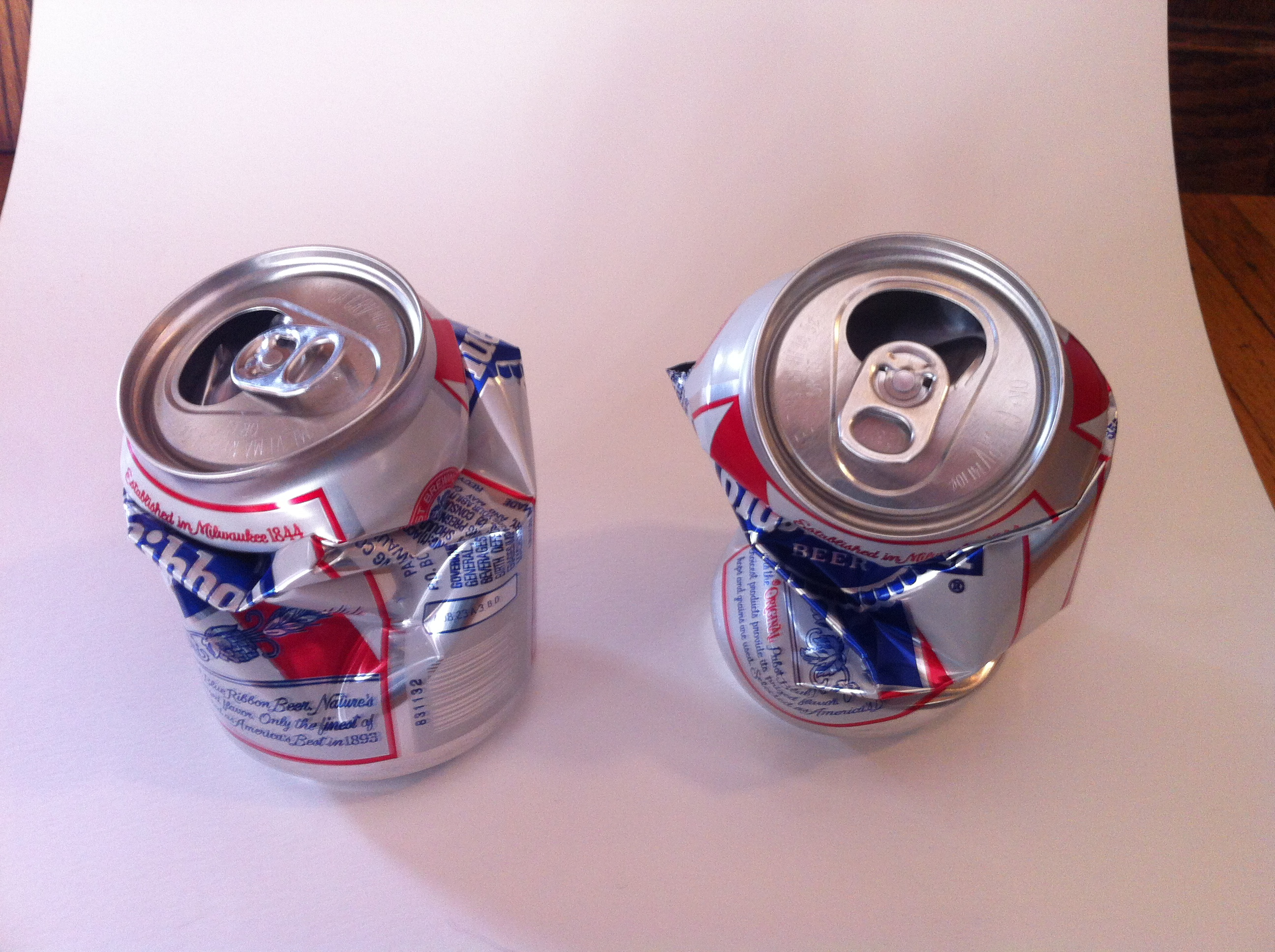
I imported the reference into Adobe Illustrator and drew the most realistic pieces of trash I could. Before the art was even started, though, I had a plan for printing. Normally, a dark color like black would be screen printed last on a poster. It’s the appropriately named “black-line”. It traps over other colors and covers registration errors during screen printing. It gives the poster a look of perfection. Being anything but perfect, I decided to print over the black-line and use it to shade.
Unless you’re a screen printer, it’s hard to fathom that metallic colors are extremely transparent. I had to add white to my silver to make it less transparent. It’s an oft-overlooked effect by designers who send work to our print shop at Monolith Press. I was able to get three shades out of my silver ink and two each for the blue and red that I printed later. It’s a nine color poster made by overprinting only five inks.
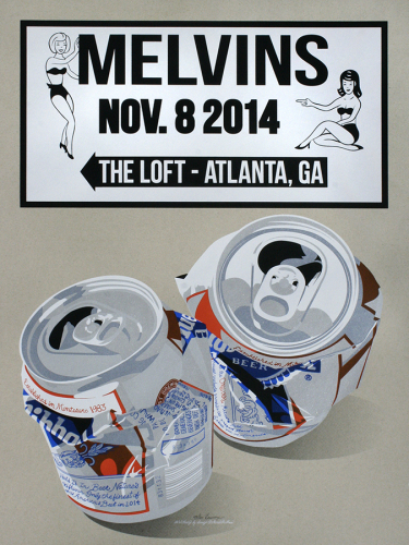
And that’s the final poster in all its attempted realism. Well, save for some of the text on the cans containing references to the Melvins history. It’s available now in my online shop. Any purchases would be appreciated to offset the cost I put in to paper, printing, and that 12-pack of Pabst that I had to drink.