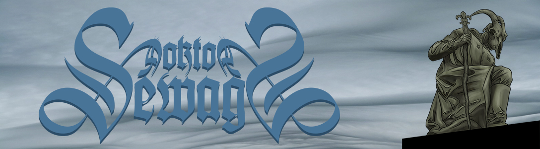
What kismet… As Sean and I display our art all month at Eli’s Mile High Club, we were booked to play a show with Impaled at the same venue. Well, if I’m displaying a mess of gig posters I’ve printed, I’d be quite the fool to not make one for this show.

Like a letter from Iwo Jima… well, a really crass letter. I’ve been thinking about hacking away at the iconic photo of the flag raising at Iwo Jima for some time. This seemed a good opportunity to do it. I’m not 100% happy with this poster, because, as usual, I was rushed. Still, I think I managed to use a few interesting techniques during the process of drawing and printing it that it’s worth sharing.
I knew right away I wanted to use the Iwo Jima photo as the basis for the poster. The first thing I put down on paper, though, was the framing that would be printed with gold ink. I wanted it to look fancy but with tinges of militarism. I looked at some Old World flags and tried to draw the ornamental animals in that style. I wanted to throw in the caduceus as well to represent the medical aspect of Impaled’s imagery.
Once I had finished one side, I knew I’d have a doozy of a time copying it on the other side. I used some tracing paper and traced the drawing with a loose graphite pencil, an 8B. I flipped it over and used the tracing paper as a rub-on transfer.

I was left with a detailed impression of the original ornamentation on which to draw. No computer copying and pasting for me, thanks!

Since I had such success with the transfer method for the frames, I decided to use it again to accurately re-create the iconic Iwo Jima moment. Okay, I fucking traced it. Cheating? Maybe. I also decided for the first time in my posters to just draw some people. All my posters have heavily featured masks. In this instance, the only appropriate mask I could think of was a gas mask. Talk about overused. Instead, I was just going to draw Impaled doing as our name connotes.
I printed out a reverse image of the classic Iwo Jima flag-raising photo. I added the silhouette of an impaled guy I found online. I think it was from the shadow puppets sequence in the movie Bram Stoker’s Dracula. Good; finally I found a use for that million dollar garbage pile.

I did the inking with Higgins Black Magic ink, the only ink I’ve found that can take my vigorous erasing to get rid of my horrible chicken scratch. I used some new 20/0 brushes I bought. Lordy, why have I waited so long to get new brushes? What a god damn difference. I’m covetous of the tiny line work an artist like Alan Forbes can do, so I’m trying the smallest brushes I can find. My unsteady bass playing hand is still a crutch. Sure, I can hit sixteenth notes, but a straight line seems far out of reach.

With little time left before I’d be able to sneak my job into our print shop at Monolith Press, I rushed the lettering. I’m not happy with it. Ce la vie, it was time to work late into the night and get this sucker done the only day I could.
I laid down a silvery white and a gold using very low mesh 137 screens. That’s necessary to get the metal flakes through the screen, but it also lays down more ink. That means my paper is bound to stretch more. That’s why it’s important to have good trapping underneath my last color, the brown line. I butt the colors up next to each other while doing the separations in the computer so I can have more play with the registration while printing, apparent once the inks are laid down.

The red fade there isn’t done with a half-tone. For those not into screen printing, it’s known as a split fountain. Usually it’s done as two different color inks that fade into each other. In this case, I ran a dark red with a clear ink extender to fade the red into the paper color.
Split fountains are tricky to control, but the theory is easy enough. You throw in two different inks, tapering the pour of each into the other. When I was doing this at midnight in a cold shop off the water in Alameda while a couple beers in, I must admit I wasn’t checking the resolution of my photos very well. It’s also hard to see the red ink on top of red emulsion, but hopefully the idea is clear enough. No pun intended.
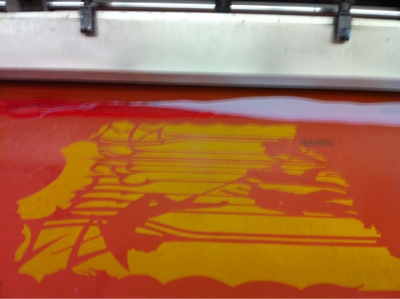
I went through a lot of set up sheets getting the inks to mix in the screen, and a lot of adjusting of the taper of inks to get the results I wanted. Even then, no print is perfectly the same as the inks tend to move a bit and sometimes drip from the flood as the machine chugs away.

Once done, the posters sit overnight on drying racks before I cut them to size the next day. At this point, they’re signed, sealed, and about to be delivered in a few hours when I head to the show.
Tonight, if yer in Oakland, come see the buy one online in my webshop! Shameless!
I've heard some comics artists claim they changed the formula for Higgins Black Magic years ago and it's not black enough for them anymore. So what they do is they leave the bottle on the window sill with the top off for a while, to let it thicken up. Pelikan is also pretty black.
Interesting about Higgins, though its still the best outta the bottle I can find. Pelican looks good until I hit it with the eraser. If i wasnt so messy at sketchin, prolly wouldnt be an issue.
Nice print Ross !
I was wondering if that red shade was a halftone .
But it's a split fountain.
i never thought of doing that with clear extender .
i still need to learn a lot .
cheers